Wednesday, August 26, 2009

Chloe blog 3. Packaging


Packaging Case Study:

“Palmolive”


In keeping with its strategy of steady brand development, the Colgate group decided to capitalize on growth in shower gels and position itself on that market by finding an innovative positioning around one of its major international brands, Palmolive.


Since shower gels are very common and have such a competitive market, the group chose to launch a new range of products enriched with essential oils, knowing that this type of product had until then ad a relatively small market.


Their challenge was to inform consumers about the

benefits of aromatherapy and make these seem attractive at the same time create a visual universe and identity for the range combining the codes Palmolive uses for the mass market with a language stressing the “natural benefits” of essential oils.


Dragon Rouge came up with a creative concept for Palmolive aromatherapy powered by two key ideas: transparency and colour.

The ultra-transparent and shiny packaging features colours that evoke ideas (green for energy and purple for relaxation)


Dragon Rouge created a window sticker for the back of the packaging evoking, in a nature-oriented and highly illustrative way, the vegetal origin of the ingredients.


Pevonia is also a range of products that were revamped by dragon rouge.

Pevonia is a skincare range which its packaging had not been updated in ten years and no longer met the expectations of a growing clientele for spa care products.


Dragon Rouge suggested that Pevonia focus on purity and sophistication, hence the generous use of white and silver and to emphasize its strength.


A more sophisticated logo, clearer-cut packaging and the use of

more refined materials all reinforce the higher-end positioning

and new modernity.


I find the new improvements very affective and i feel as if they have achieved their ideas and goals for their new take on packaging.


http://popsop.com/category/case-study

Tuesday, August 25, 2009

"Publication Design"

Standing out on a crowded shelf requires an arsenal of cool design and excellent content!

Visit any newsstand and on the display racks you'll find dozens of magazines, all vying for your attention. Some are bold, some understated and others are classics that we have formed a relationship with over the years. Yet how do you make a magazine stand out from the crowd? The answer is there is no one true factor that ensures a magazine's success, but rather it is a combination of great design, good font choices, excellent content, format and of course an eye-catching cover.

WOODEN TOY


Wooden Toy magazine is a world renowned skate and design magazine, the trademark of which is super slick design mixed with decidedly impressive content by magazine's founders Timba Smits and Chris Meyer. The 'no rules' layout and design of Wooden Toy magazine is largely a credit to art director Smits, a self-confessed typography perfectionist. When he can't find a font to suit a certain page design, he hand draws the type himself, before scanning it into his trusty workhorse, an old Mac G4, and colouring it in Photoshop. The results are striking to say the very least. "We developed a publication with no fixed positions and a dedication to quality design and intricate typography. Each page is treated like a new publication itself," he says. Smits is also quick to point out that Wooden Toy is now in a class of its own. Strictly limited to 5000 copies, making it even more of a collector's item.


Mag's like "Wooden Toy quarterly" ar'nt the typical mag you would pick up doing the grocery shopping, reading it at the register...You know the ones with the fashion, latest recipes and most importantly...gossip of the stars! but what you dont know, or maybe hav'nt ever realised is the continuous repeatition every week, month etc. Each page, templated for each section. Its not creative, not adventurous, not personnalised or artistic, definately graphically layed out perfectly every time. but hey!...you found that little black dress you always wanted or those pair of Sex in the city heels you've been dying to try on, right!

I guess you get the jist of what im trying to say....so i found some other awesome mags worth checking out, like "King Brown" and "Monster Children"

KING BROWN

You cannot help but fall in love with King Brown from the moment you remove it from its custom designed brown paper bag. The first things you'll notice, aside from the fact that it is a weighty and wonderful looking magazine, are the added surprises that come with it, usually stickers, confetti or stars, a coaster and other various extras. The magazine itself is beautifully designed and features the work and words of various artists, both local and international. King Brown is what you might call an independent magazine, as it does not have the backing of a big publishing firm behind it and runs on the passion of its staff. The magazines founder, Yok, an artist from Western Australia, started King Brown after seeing his first Lodown magazine. King Brown's content has a focus on art in all of its forms and the featured artists are allocated six pages each in which to showcase their work and tell their stories.


MONSTER CHILDREN

First the name grabs your attention. Then, after flipping through the pages of this beautifully designed magazine, it is easy to understand why it has gained so many compliments from peers and readers alike. The content is varied, but at the end of the day is derived, as co-publisher and art director Campbell Milligan advises, from skateboarding, snowboarding and surfing. You will also find, however, a diverse range of articles on completely unrelated topics, such as the gangs of Papua New Guinea. The readership of Monster Children, which is itself an assorted collective, can range from students through to an architect living in Norway.


I love the way these magazines represent raw artistic talent, freedom to push thier creativity to the limit. No rules!

Wooden Toy mag has its own personal style, each and every detail is unique in itself...page after page, and has a handmade, personal feel towards the reader. Wooden Toy's intriguing articles, layout, illustrations, artistic flair and great sense of humour will have you struggling to put the book down. And to make it that little more personnel...each issue presents you with an official certificate of authenticity......with love.


http://www.woodentoyquarterly.com/
http://www.kingbrownmag.com/
http://www.monsterchildren.com/

Thursday, August 20, 2009


Here Are some more "soopkichn" images there "amazing" right.:)


here are the images for the "soopkichn" guy i was talking about hope you like em.My personal fav is the deer hunter one.Please feel free to give me any feed back xxxooo

Wednesday, August 19, 2009

P... P... P.... PACKAGING!

CHOCOLATE PACKAGING
Almost everyone loves chocolate... but probably no-one as much as me
.


White
, milk or dark
!


For those of you that simply just DON'T LIKE CHOCOLATE... there is something really wrong with you and here is some great packaging to place around the house to help you look normal.


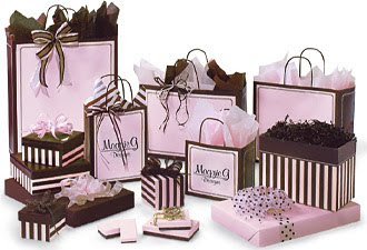
Looking more like jewelery packaging than chocolate, nashvillewraps.com, an American company are attracting customers on a whole new level which seems to be the way things are going with design at the moment. (Above)

The range below have boxes you can actually reuse for trinkets and the choice of colour is brilliant. What girl wouldn't want to receive these chocolates for Valentine's Day? (Below)

Another example of a stylish solution to box up our favourite treat.

I feel this is not so sexist! (Below)


Very stylish and elegant. This design for Melt chocolate's was done by an American design student. (Above and Below)
Using a popular character on packaging to sell the product, pure genius! (Below)


Two of the largest competitors in Australia, Cadbury and Nestlé, have recently had an overhaul of their packaging. Going from foil wrap to cardboard. The idea is to cut costs, modernise their image, and hopefully encourage people to recycle more.
A lot of what you buy is recyclable but the amount of packaging is excessive and needs to be cut back dramatically. Valentines and Easter chocolates being the worst offenders with Easter eggs having over 60% of the product being the wrapper!

BEFORE


AFTER


In conclusion I would formally like to state that I LOVE CHOCOLATE!
Who cares about the wrapper, as long as it tastes good.

Thank you for your time,


Elisha Solomon

www.independant.co.uk/environment/greenliving

Post 3. Website Design - Chris Nowlan

Website Design

Virgin Mobile

Problem

The average Virgin Mobile customer is still in his teens. His cell phone isn't for calling the office or checking his schedule; it's for connecting with friends, making plans, and downloading ring tones. It is for staying in touch with his culture, a youth culture that is always on the move. Virgin saw that its users cared more about community than utility, and knew it was time to change its image from a pay-as-you-go telecommunications provider to a youth wireless network.

Response

The design team began an in-depth exploration of youth culture, hitting the streets in hip New York neighbourhoods to see what was happening. They found a culture that thrived on music and art, media, and each other. They wanted to communicate quickly and cheaply, not only through phones, but also in every way possible - email, text messaging, note passing, and conversation. The design team also conducted industry analysis to determine a new identity for Virgin Mobile that would balance the fashionable and the trustworthy, the edgy and the reliable. Because Virgin Mobile users are so young, parents often foot the bill for their mobile devices. The website had to be cool enough for its users, but professional enough for their parents.

Result

Customers love the simplicity of the design, its new offerings, and its community partnerships. Links to the site have been showing up on youth discussion boards and blogs across the country. And this new devotion to teen culture is just the beginning: frog's re-branding of the website provided an information structure flexible enough for further extension into on-site blogs, community posts and concert updates, music reviews, and other features.


Other Examples

The blockbuster website, which launched in September 2006, promises to bring Blockbuster's online positioning up to the level of its storefront success. Rather than a simple redesign of site aesthetics, the update puts power in the hand of the user, with high-level functionality and a true incorporation of personal choice.


The resulting site helped position Microsoft Windows Mobile as a leading force in the mobile communications space, setting the benchmark for online marketing, support, and evangelism of mobile software and devices.


Bibliography

http://www.frogdesign.com/case-study/virgin-mobile-website-design.html 20-8-09